Hello everybody. Today we will be doing a super gentle introduction to Exploratory Data Analysis. Any visual learners out there? If yes, high five!!! Because I will include lots and lots of charts and graphs to help with understanding. Apart from all of the coding, I will be highlighting useful tips and tricks along the way. So let’s make yourself comfortable and hop right in.
What is Exploratory Data Analysis?
What do you do when you first meet a new friend? Well, you have to say hi, ask how he or she is doing and that’s how the conversation starts. Similarly, Exploratory Data Analysis, or EDA in short, is also how you start the conversation with your dataset to understand what each column means and how they are related (or not related) to each other.
Exploratory data analysis is an attitude, a state of flexibility, a willingness to look for those things that we believe are not there, as well as the things we believe might be there.
John tukey
Here is what you will gain from EDA.
- Understand the data type and meaning in the business context
- Spot outliers, trends, patterns, missing values for every single attribute
- Assess and confirm our theories about how attributes relate to each other
What data will we use?
We will be using a marketing campaign dataset obtained from a bank in Portugal. The dataset can be downloaded from here.
The bank conducted a marketing campaign mostly via phone calls to offer clients to place a term deposit. If the client agreed to place the deposit, the client is marked as ‘yes’ for subscribing to a term deposit. Otherwise, the client is marked as ‘no’.
EDA will be the first step in our mini-project to predict whether a client will subscribe to the deposit based on details gathered from the marketing campaign.
How do we conduct an EDA?
Here is a quick guide on how to conduct an EDA.

Enough of the talking, let’s start coding together, shall we?
Exploratory Data Analysis
Library and Data Import
Let’s start with importing the libraries we will be using for EDA.
# Data Manipulation
import numpy as np
import pandas as pd
import math

# Visualization
import matplotlib.pyplot as plt
import missingno
import seaborn as sns
from pandas.plotting import scatter_matrix
from mpl_toolkits.mplot3d import Axes3D

# Managing Warnings
import warnings
warnings.filterwarnings('ignore')
Next, get our dataset imported and ready for action.
# Data Import
data = pd.read_csv('C:/Users/Lenovo/Downloads/PortugalBank/bank-additional-full.csv', delimiter =';', na_values = 'unknown')
# Remember to update the filepath to the correct location where you have saved the CSV file
As promised, here are my 2 tiny tips to import data.
Tip 1. Always double-check the delimiter of the CSV file because many CSV files do not use the default delimiter. See in this case the delimiter is semi-colon (;)
Tip 2. When using pandas.read_csv, it is NOT required to use ‘with open’. Opening and closing the CSV file after reading it is not required for pandas library. Only use ‘with open’ if you are reading the CSV file with the csv library.
Univariate Data Analysis
Review summary statistics
By default, the describe method in pandas will calculate the mean, quartiles and standard deviation on numeric features in the DataFrame only. However, I have opted to pass the include parameter to include both categorical and numerical columns.
- Numerical: quantitative values that we can perform arithmetic operations (+ – * /)
- Categorical: qualitative values that we can group data with similar characteristics
Also, I decided to transpose the summary statistics because it is easier to see the list of all columns in a single view. Just my personal preference and you may leave the transpose out.
# Transpose the summary statistics for better view
data.describe(include='all').T
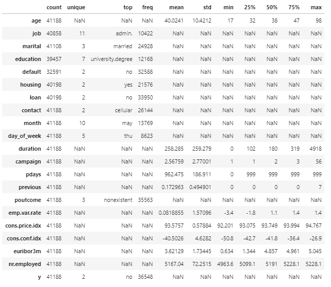
Here is what to look out for when reviewing summary statistics.
- Do the maximum and minimum values make sense? For example, a client’s maximum age cannot be 150 (Fun fact: Up to now, no one has ever lived for more than 123 years.) A client’s minimum age cannot be negative.
- Are there any infinite values? This could mean potential outliers that require cleansing.
Review data types
Next, we try to understand whether each column contains integers, floats, strings or Booleans.
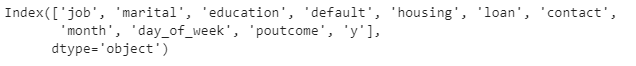
# Review data types of each column in Qualified Leads
data.dtypes

The key takeaway from this step is to divide the columns into 2 buckets based on the data types.
- Categorical: job, marital, education, default, housing, loan, contact, month, day_of_week, poutcome, y
- Numerical: age, duration, campaign, pdays, previous, emp.var.rate, cons.price.indx, cons.conf.idx, euribor3m
Why do we need 2 buckets? Because each bucket will receive slightly different treatment when plotting distribution.
Understand what each column means
As we roughly understand the summary statistics and the data types of each column, let’s dig a bit deeper to understand what each column actually means in the business context.
In a real-life project, we can confirm our understanding through several approaches.
- Refer to the business data standards or data dictionary (if any)
- Consult business users and subject-matter-expert
- Make an educated guess based on business context and confirm the understanding with business users
Fortunately, we can refer to Kaggle for some context about what each column means.
Examine data distribution
Now comes the fancy handsome visualisation that we all look forward to. Let’s tackle categorical data first and here is a stress-free efficient way to plot the distribution of categorical data all at once.
Categorical data
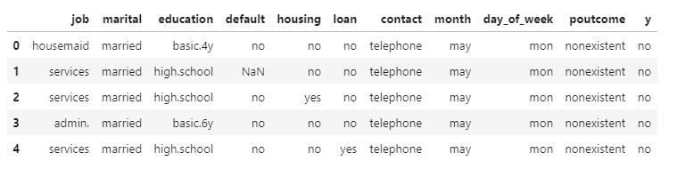
# Identify column names containing categorical data
categorical_column = data.select_dtypes(object).columns
print(categorical_column)
# Isolate all columns containing categorical data
data_categorical = data[categorical_column]
data_categorical.head()
# Define a function to plot distribution
def plot_distribution(dataset, cols=5, width=20, height=15, hspace=0.2, wspace=0.5):
    plt.style.use('seaborn-whitegrid')
    fig = plt.figure(figsize=(width,height))
    fig.subplots_adjust(left=None, bottom=None, right=None, top=None, wspace=wspace, hspace=hspace)
    rows = math.ceil(float(dataset.shape[1])/cols)
    for i, column in enumerate(dataset.columns):
        ax = fig.add_subplot(rows, cols, i+1)
        ax.set_title(column)
        if dataset.dtypes[column] == np.object:
            g = sns.countplot(y=column, data=dataset)
            plt.xticks(rotation=25)
        else:
            g = sns.distplot(dataset[column])
            plt.xticks(rotation=25)

# Plot distribution of categorical data
plot_distribution(data_categorical, cols = 2, width = 15, height = 15, hspace = 0.5, wspace = 0.3)

Here is my tip on what to look out for when examining the distribution of categorical data.
- How many unique values are there per column? You can also check the summary statistics for unique values. If there are too many unique values, the column might possibly be one of the following scenarios.
- A free text field (e.g. tweet, product reviews)
- A numeric column containing invalid characters (which will require some data cleansing to retrieve the correct numerical data)
- A unique ID (e.g. SalesOrderID, CustomerID)
- A DateTime stored as string (which you will need to convert string to DateTime format)
- Are there any invalid values? For example, if we have the column day_of_week, we expect the valid values include 7 days of the week instead of some weird random text. Invalid values are a gentle reminder that you have to cleanse the data later on.
Numerical data
We will move on with numerical data. Again, let’s plot all distribution at once because who doesn’t love a nice shortcut. Hehehe.
# Isolate all columns containing numerical data by dropping categorical data
data_numerical = data.drop(columns = categorical_column)
data_numerical.head()

# Plot distribution of numercial data
plot_distribution(data_numerical, cols = 2, width = 15, height = 15, hspace = 0.5, wspace = 0.3)

# Create box plots to summarise numerical data
def box_plot(dataset, cols=5, width=20, height=15, hspace=0.2, wspace=0.5):
    plt.style.use('seaborn-whitegrid')
    fig = plt.figure(figsize=(width,height))
    fig.subplots_adjust(left=None, bottom=None, right=None, top=None, wspace=wspace, hspace=hspace)
    rows = math.ceil(float(dataset.shape[1])/cols)
    for i, column in enumerate(dataset.columns):
        ax = fig.add_subplot(rows, cols, i+1)
        ax.set_title(column)
        g = sns.boxplot(dataset[column])
        plt.xticks(rotation=25)

box_plot(data_numerical, cols = 2, width = 15, height = 15, hspace = 0.5, wspace = 0.3)

Here is what we need to pay attention to when glancing through the distribution.
- Is the data skewed or normally distributed?
- What are some of the values? Do we have infinite values or invalid values? These potential issues might be the reason why some of your math operations fail subsequently.
Assess missing values
The last thing on the list for Univariate Data Analysis is checking for missing values. Why do we have to bother checking for blank? Because…
- Missing values can produce biased estimates, thus resulting in misleading conclusions.
- Many machine learning algorithms to derive business insights do NOT support data with missing values.
But first, we have to answer one crucial question. How are missing values being expressed in our dataset? Is it NaN, NULL, or an explicit string such as “undefined”, “unknown”, “N/A”, “-“, or the number 0? There are 3 ways to answer the question.
- Observe, observe and observe the dataset in detail. If there are many unique values in a column, I personally find the distribution plot really comes in handy as all unique values are listed.
- Read the documentation/ notes describing the dataset as closely as possible. For example, in this Kaggle dataset, we know that missing values in some categorical attributes are coded with the “unknown” label.
- Ask business users about how they capture missing values (if possible)
The best practice to handle these scenarios is to mark missing values with a NaN when loading the CSV file, which I have done with the na_values parameter at the first step.
data = pd.read_csv('C:/Users/Lenovo/Downloads/PortugalBank/bank-additional-full.csv', delimiter =';', na_values = 'unknown')
To stay true to the spirit of being a visual learner, we will replace all “unknown” label with NaN and use a library call missingno to assess missing values in the dataset. Here is how to do it.
# Display nullity matrix
missingno.matrix(data, figsize = (20,5))

The nullity matrix offers a good visual to assess missing values across all columns. The more whitespace there is, the more missing values a column has.
# Rank features based on descending number of missing values for Closed Deals
missingno.bar(data, sort = 'ascending', figsize = (20,5))
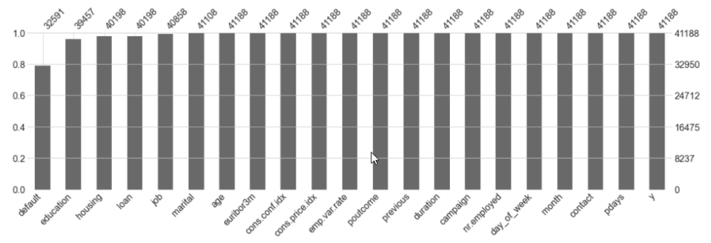
The bar chart helps us to understand the proportion of missing values versus complete values. The higher the bar, the more complete values a column has. And just in case you want to know the exact number of missing values for each column, here is what you need.
# Count missing values per column
data.isna().sum()
Bivariate Data Analysis
So far we have only examined each column one by one. Now is the time to step up a notch and understand the relationship between columns. Just to give you an understanding, below are a few things we can examine.
- Compare categorical values to categorical values
- Compare numerical values to numerical values
- Compare numerical values against categorical values
A few interesting insights that I have gathered from bivariate data analysis.
# Relationship between outcome of previous campaign and client's decision to subscribe to term deposit
sns.countplot(y='poutcome', hue='y', data=data)

If the outcome of the previous campaign is successful, the client was much more likely to respond positively to this campaign (i.e. say yes to subscribe to a term deposit).
# Effect of last contact duration and marital status against decision to subscribe to term deposit
plt.style.use('seaborn-whitegrid')
g = sns.FacetGrid(data, col = 'marital', size = 6, aspect = 0.7)
g = g.map(sns.boxplot, 'y', 'duration')

Clients who said yes to deposit generally had a longer call duration. Based on some other additional plottings, I observered this trend applies across all categories of marital status, mode of contact (i.e. telephone or cellular) and job.
These are by no means the limit. What we want to discover is how different attributes play a part (or no part at all) in influencing whether a client decided to deposit with the bank after the campaign. So give it a try and see what else can you discover?
So what’s next?
To wrap up our short introduction to EDA, here is the most important takeaway for you.
Never skim on EDA, especially when you have tight deadlines to meet. A proper EDA will help you avoid chasing after the wrong things and wasting more time to rework.
I really hope the blog post has been useful. If you find the blog post to be helpful to someone else, please share. With lots of love and see you next time!
