
Show me the interactive version
Inspiration
I have always been a fan of feature-rich yet clean dashboard like the Income Statement created by Andy Kriebel. So it all started with the idea to replicate the same dashboard to learn how he created it.
But what else can I learn? What is the additional business knowledge that I can take away as I work on the dashboard? So here is what I told myself, “Hey, let’s start exploring an industry that I have never worked on before. We shall see what financial ratios are important to them.” Somehow, banking industry just randomly popped up and that’s what I went ahead with.
Dataset
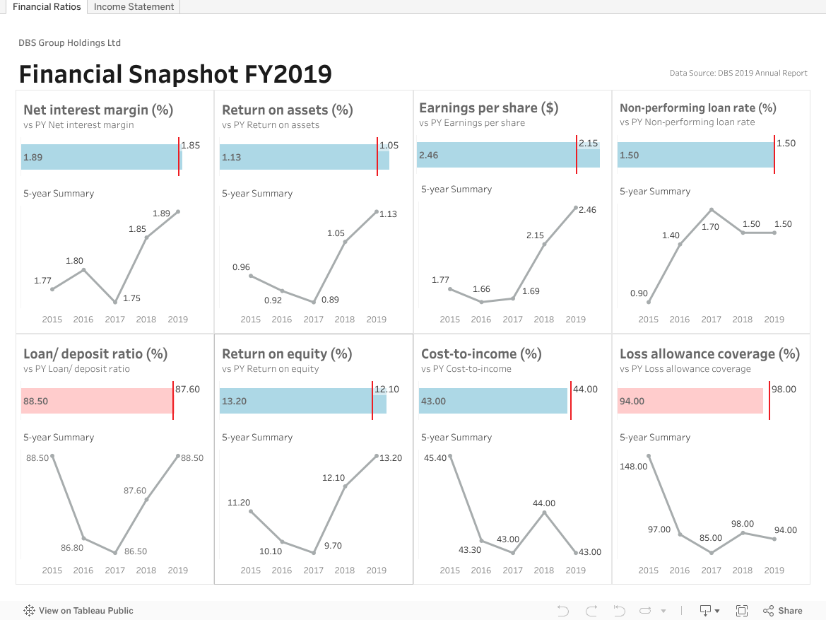
The dataset was DBS Group Holdings Ltd Annual Report 2019 that I downloaded from their website in PDF format. If you are interested in exploring the data, you may find both Python script and the extracted dataset on my GitHub.
My takeaways
Business knowledge
- When assessing a bank, there are 2 major aspects to consider. They include profitability and risk.
- Net interest margin, return on equity, earnings per share and so on are typical profitability indicators. In the dashboard, I have included the tooltip to explain what each financial ratios means.
- Risk is slightly more difficult to quantify and spanned across different areas such as business and strategic risk, credit risk, market risk, liquidity risk, operational risk and reputational risk. At the moment I haven’t got any concrete idea on how to explore the risk element yet. So that could be a topic for future projects.
- Banks are heavily regulated. I came across Capital Adequacy Ratio when reading the annual report and have learned heaps from this article explaining the Basel III International Regulations.
Technical skills
Lots of fun working on this dashboard for the past 2 days is all I can say. Here is what I have done.
- Python
- Extract data from PDF file using tabula-py module
- Cleanse and unpivot DataFrames with pandas
- Tableau
- Dashboard design & styling with containers
- Waterfall chart illustrating how income and expense contributes to the net profit
- Rounded bar chart to avoid overusing normal barchart
- Combination chart showing comparison between current year and previous year (the same principle can be applied to compare actual vs target).
