Show me the interactive version
What is it all about?
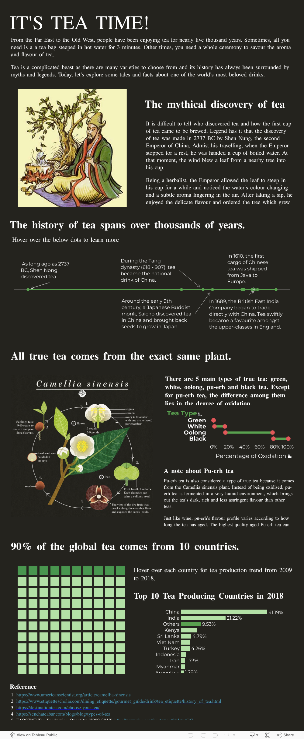
The “It’s Tea Time” dashboard is a fun piece of data visualisation about the history of tea. The dashboard showcases the following Tableau capabilities.
- A timeline of event with annotations
- A dot plot chart showing the minimum and maximum range of values with dual axis
- A waffle chart showing part-to-whole relationship
- A bar chart with tooltip showing a line chart
- A dashboard designed in the form of an interactive infographics
All dataset can be downloaded from my GitHub, together with Python script to clean the FAOSTAT csv file.
