Show me the full data visualisation
What I was doing for my personal data projects wasn’t working. I started something, worked on it for a while, got stuck, then abandoned it when a more exciting idea comes along. During the last week of 2020, after taking a hard look at my half-done projects, it occurred to me that something has to change.
So I started reflecting on my past experience, reading through a couple of productivity books and reviewing my favourite project deliverables. Here are 2 things I realised.
- Those abandoned ideas got abandoned because I simply felt they aren’t good enough or I don’t have enough technical knowledge to make it happen.
- My best work materialised when I had to conquer a challenging yet inescapable task and not quite enough time for it.
If I can hit the F5 key to refresh, what can I do differently? Here is what I did.
Just start with something my sister and I love
Without leaving myself enough time to ponder (and potentially suffer from analysis paralysis), I decided to start with a topic that my sister and I both love. Why did I think about my sister? Because she has always been my best friend and anchor through thick and thin. If you’re having a mental block or self-doubt, then thinking about the people you love and creating something fun for them will definitely spark joy and motivation. This is also the most important message that I hope you should take away from this post.
A few ideas came up but on a quiet cooling night and being home alone, nothing can beat those spine-chilling horror films. Hmm, there are plenty, but which one? Well, no doubt it has to be The Conjuring Universe, a horror franchise that both my sister and I love the most. What’s not to love if I can share a few interesting facts from our favourite horror series with my sister?
Yay! Now I got a topic, but what can I do with it? Well, let’s Google and see what data is available.

Wikipedia was the first stop and there are a couple of interesting tables showing all movies and characters of the franchise (Annabelle and Valak, anyone still remembers?), their total worldwide gross, ratings and the chronological timeline of events. Those are great starting points for simple analysis for commercial success and public response.
I also came across several pages and it seems people are interested in how each film is tied in with the frightening universe of devils and ghosts. This would be great to add some interesting fun facts too. As soon as I browsed through the content, an idea slowly formed. A dark creepy data storyboard introduces facts about The Conjuring Universe. I know that’s something my sister would love to see.
Set a tight deadline
Knowing that I work better when I am rushing for time, I set the goal to gather and analyse data, then design and build a dashboard within 2 days. My instinct told me that a 2-day duration would be just nice to stay motivated while feeling the pressure to be productive. Here is my plan of attack.
- Day 1
- Morning: Map out the goal & a rough sketch
- Afternoon: Gather & analyse all data
- Day 2
- Morning: Build charts
- Afternoon: Finalise the story, create and test the final storyboard
Well, that sounds like everything I need to get started, or so I thought. But if I am sticking to my old habits, doing the same thing over and over again, how can I expect a different result? This time, I need a new approach.
Focus on what’s truly important
I appreciate the fact that I am self-critical. Not the best trait to have, I know. This has blessed me with the drive to upholding some decent standards, yet it also occasionally triggers worries from countless ‘what if’ scenarios. And I know it too well that if I don’t find a way to cope with my self-criticism, my 2-day project will quickly become a 2-week marathon. But how?
Firstly, I acknowledged that having only 2 days means I have to seriously think about the practicality of things. In short, keep it simple, stupid! Secondly, I have to set ground rules to make peace with my self-critical personality. Being inspired by The Agile Manifesto, I have written the below 6 ground rules to ensure my focus on what’s truly important.
- Good-enough completed product over perfect half-done work
- Rough sketch over a detailed plan
- Results over utilising fancy techniques
- Adapting to change over following a plan
- Simple meaningful charts over complex visuals
- Seeking help over trying to figure out myself
Throughout the 2-day duration, these bullet points have been extremely helpful in guiding my decisions and helping me to stay on track. Guess what? I think they are reusable for future projects too.
Let user stories define the purpose of communication
Confession time: I am a fan of user stories. No, I am not talking about long-winded product reviews. What I mean is several short and sweet sentence following a general structure like “As a [end user role], I want [ability or feature of the product] because [of whatever benefits I can gain or hassle I can avoid].” You may usually find user stories being used to capture functionalities for software products. But I personally find user stories extremely effective to make sure users come first in whatever I am working on. Here is what I wrote for The Conjuring Universe storyboard.
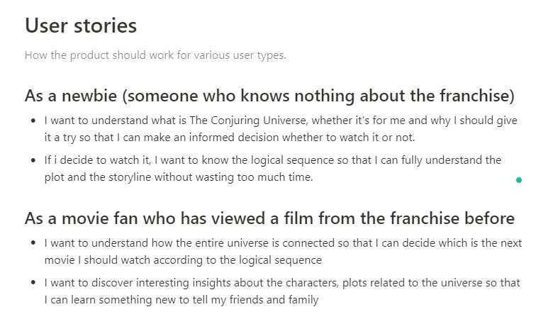
Oh, wait! Why bother writing stories when I didn’t have enough time to begin with? During development, these user stories help me to clarify what the audience wants so that I don’t waste time on gathering irrelevant data or building non-value added features. Just gotta be brutally focus on the main goals since time is ticking, don’t you agree? What’s more? During testing and review, the stories help me validate whether my storyboard is completed and working as expected. I reckon 20 minutes for spamming these user stories and wrapping my head around the ultimate user-oriented goals were truly well spent.
If you would like to know more about how people have been writing user stories for software development, check out this awesome article. Lazy to read? Don’t fret, here are my 3 quick tips for everyone on user stories.
- Try to generalise individual users into groups (a.k.a. personas) with similar goals, wants and needs. That way you don’t end up with hundreds of stories.
- Follow the above-mentioned general structure above. It’s simple, concise and it just works.
- Whenever you feel lost, always refer back to the user stories.
Embrace the good, the bad and the ugly
So far, things seem to be too good to be true, or so you thought. But let me share some insights about what went wrong and how I managed to pull myself out of the mess. Mistakes shouldn’t happen more than once, so hopefully, you can avoid making the same mistakes that I got myself into.
Creating the first sketch
I started my first sketch by looking at the data and doodling on a blank piece of paper. Nothing wrong with that if you are genuinely creative and good at drawing. But I know I don’t. Unsurprising, 30 minutes passed and all I have was some weird boxes with no concrete idea. Only 30 minutes left until I ate into my data collection time. Red flag! It’s time for Plan B.
How about taking a look at what other people are visualizing for movies? So I went to look at Tableau Public Gallery, focusing on the Film and TV section. A world of possibilities suddenly opened up to me. Since not much time left, I just gotta find a shortcut. So I took screenshots of those designs I like and placed them into a common depository. Below is what I did in Notion, my trusted all-in-one workspace. But you might want to open a PowerPoint blank slide and start pasting some pictures inside.
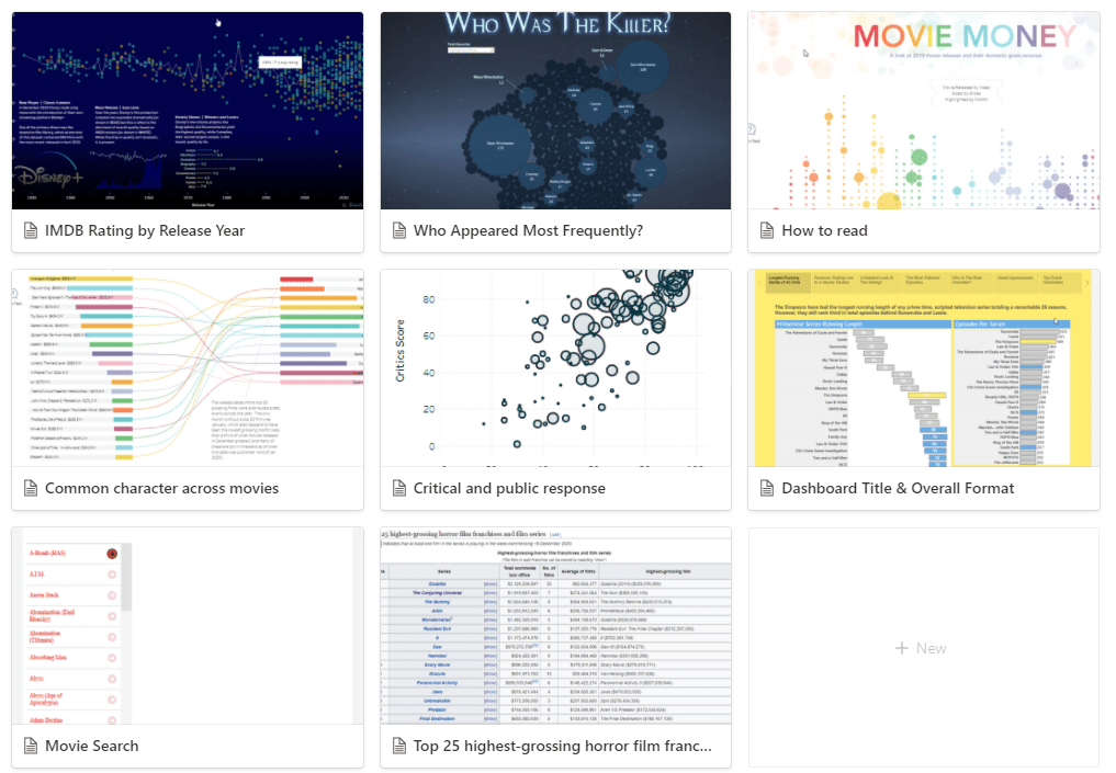
Can’t find any nice design? Well, then start with simple boxes stating the content you want to present. The sketch is meant to guide what data you need to collect, but the data you can collect will determine how the final charts will look like. So stick to the timing and don’t get hung up on the small details. When it comes to sketching, I prefer electronic format over paper and pen because I can easily edit, move things around and add new things along the way. But you might think otherwise and that’s totally fine. The lesson here is to remember to seek help and inspiration from others instead of forcing myself to reinvent the wheel and create some magic from thin air.
Collecting data
From the get-go, web scraping has been one of the skills I want to practise in this project. So I happily dived right in, wrote a whole bunch of Python scripts to extract data from several web pages, spent a lot more time to debug and test my scripts to make sure that they work.
But wait! Would manual copy and paste work faster? Sadly, yes! With several tables containing simple statistics about 7 movies across different websites, a bunch of characters and production team members, it turned out that I can just copy and paste it into an Excel file, clean up the details a little bit and my dataset is ready for action. Fortunately, being conscious of the tight 2-day duration once again caught me at the right moment. At the rate I was working with, I wouldn’t be able to complete my data collection within the first day. Remember the 6 ground rules I wrote before? Results over utilising fancy techniques. And that’s how it had saved me from unnecessarily wasting more time.
Visualising data in Tableau
I had to admit that fiddling with the colour, the font, font size and trying to maintain a consistent format across different pages was annoying. Various options of customisation in Tableau also added to my confusion sometimes. I regretted having to learn the hard way on how to properly format a Tableau dashboard. But hey, it’s better late than never, right. Here are a couple of time-saving tips that might come in handy for you.
Initial setup
- To ensure consistent format across different pages, focus on designing a page and reuse it as a template over and over again. That way you don’t have to worry about how the text on page 1 is bigger than that on page 2.
- To avoid reworking on formatting, publish the template first to test how it actually looks on the final displaying medium. I didn’t do it early enough and had to individually edit the font colour as the colour in Tableau Public somehow appeared darker than what I have seen on my screen. Don’t be like me!
Create individual charts
- To adjust the chart size, use the Cell Size Hotkeys (Format > Cell Size) instead of painfully trying to find the edges of the cell and drag it with the mouse
- To drag multiple measures on and off the canvas, use the CTRL key instead of dragging them one by one
- To duplicate a field using the same measure twice for a duel-axis chart, hold down the CTRL key and drag the pill right next to itself instead of getting lost while sifting through a bunch of other fields on the left menu (and accidentally dragging a field having a similar name)
Consolidate the storyboard
- To hide all sheets related to a completed dashboard to avoid accidental modification.
- To avoid configuring the navigation flow too soon because chances are you will adjust the sequence of the dashboards during testing. I did it too soon and ended up having to update it again and again. That just gotta wait until I am absolutely happy with the logical flow of the content.
Finish the final touches
- To test how the visual look on the phone display via Device Preview and customize accordingly (if time permits) instead of enthusiastically showing it to your friends and realising the format was messed up when viewing via phone. How embarrassing!
Just in case you are wondering what the end result looks like after 2 days of development (plus a few silly formatting issues resolved after that), feel free to check out the final product here.
Wrapping Up
It’s difficult to maintain great motivation for personal projects because you simply don’t get paid for it. But if I can learn so much from a 2-day project, so can you. Personally, I choose to believe that all learning, grit, passion and perseverance is building up to something. Taken individually, each tiny project might not feel super important to me. Yet, I realised I have picked up a ton of skills, which enabled me to take on bigger projects with greater confidence.
So if you are feeling stuck or think you have lost the motivation to try something new, here are my 4 simple takeaways. Hope they would shed some light and bring back the mojo when the going gets tough.
- Think about the people you love and create something that will make them smile. It’s the simplest way to break the mental block and have more fun with data.
- Never wait for that perfect moment. Working with data has taught me that I don’t need to know everything before getting started. It has always been the other way round. Just dive right in and that’s how I slowly know a bit more from here and a touch more from there. You will never know everything and that’s how we all learn.
- Make sure the deadline you set is short enough to stay committed. Pressure has naturally forced me to focus on the final goal, eliminate unnecessary waste and think on my feet.
- Embrace the good, the bad and the ugly. Being able to recognise your weaknesses, bad traits and silly mistakes, then taking actions to make peace with them means you are well on your way to becoming the best version of yourself.
With that, I wish everyone a healthy, happy and amazing 2021. With lots of love!
